
How to Look Better on Camera and Photos? Start with Color Analysis
How to look better on Zoom - color analysis tips
If you're showing up in your career—in meetings, on camera, on stage, or online—how you present yourself matters. It’s not about being trendy or perfectly styled. It’s about looking clear, credible, and like yourself, at your best.
Here’s what most people don’t talk about:
A great outfit in the wrong color? It falls flat.
But the right color—even in a simple look—can make you feel confident, sharp, and fully in your vibe.
That’s why color analysis isn’t just about fashion—it’s a visibility tool.
And for women like Leila Hormozi, Natalie Dawson, Codie Sanchez, and Elena Cardone, that kind of detail is the difference between a strong brand... and an unforgettable one.
So, What Is Color Analysis—Really?
Color analysis is the process of discovering your most flattering colors based on your undertone, depth, contrast, and saturation level. It helps you stop guessing and start dressing with strategy.
We don’t just look at “cool vs warm.”
We look at your chromatic profile:
Are you Deep or Light?
Are you Cool or Warm?
Are you Bright and Clear, or Soft and Blended?
Do bold contrasts lift your face—or overwhelm it?
Do deep shades ground you—or drain you?
Once you know your season—like Soft Autumn, Deep Winter, or Bright Spring—you can use it as your style GPS. It guides everything from hair color, makeup, coats and lighting. However, what you need to know is that sometimes you won’t fit neatly into one season. That’s why I focus on identifying your key features—and why I use the 16-seasonal color analysis system, not just the traditional 12.
Why It Matters More If You’re on Camera
(Like… All the Time)
You might not think of yourself as a “celebrity,” but if you're running a business today, you're probably more photographed, filmed, and visible than most actresses in the early 2000s.
Between:
Zoom calls
Content creation
Branding photo shoots
Podcast interviews
Speaking engagements
Mastermind events
...you are constantly being seen. And you have fewer chances to get it wrong than someone who’s rotating through stylists and wardrobe teams every week.
This is exactly why online color analysis matters for women in leadership and content. It helps you:
Choose the right colors for high-conversion content
Know what looks best on your skin tone on camera
Avoid last-minute makeup mistakes
Build a wardrobe of pieces that work together
Simplify shopping, packing, and getting dressed

Jessica Alba Colour Analysis - True Autumn
Jessica Alba: A Case Study in Subtle Mismatches
Jessica Alba is stunning—but even with strong style and great taste, certain details can shift the whole look. In her case, it’s often the hair color.
In the carousel example, her dress and makeup are spot on: soft, warm neutrals and earthy blush tones that suit her golden undertone beautifully. But her hair? A touch too dark and cool. It slightly throws off the balance and takes away from what could be a fully harmonious look.
This is exactly where color analysis comes in. It’s not about drastic changes—it’s about those small, smart adjustments that take you from “almost right” to completely in sync. Even if you have a good eye, understanding how your hair, skin, and wardrobe tones work together can elevate everything.

Jessica Alba Colour Analysis - True Autumn
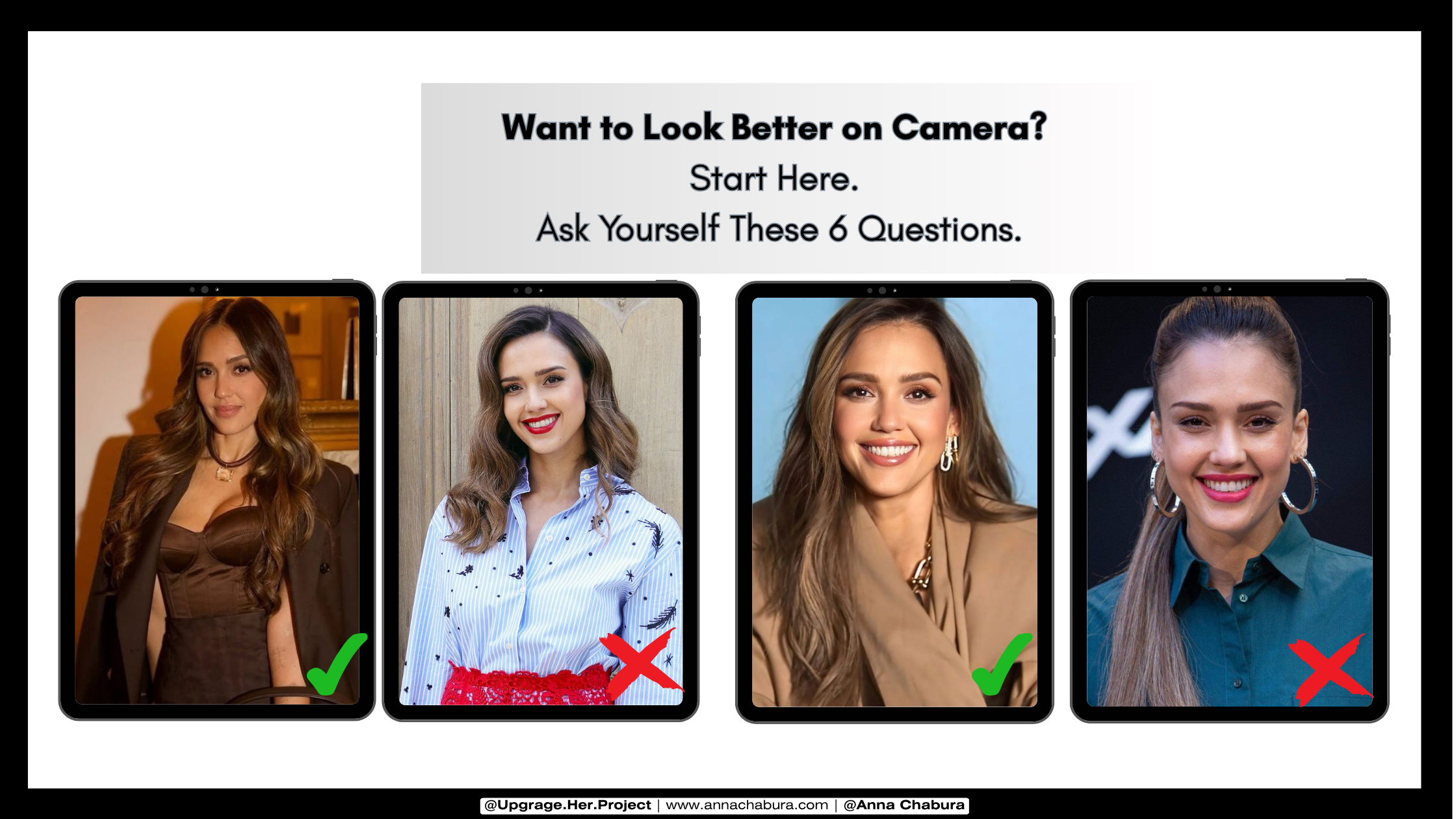
6 Questions to Ask Yourself Before Your Next Shoot or Speaking Event
Use these color analysis prompts to build your outfit strategy like a pro:
Do I look better in warm or cool colors?
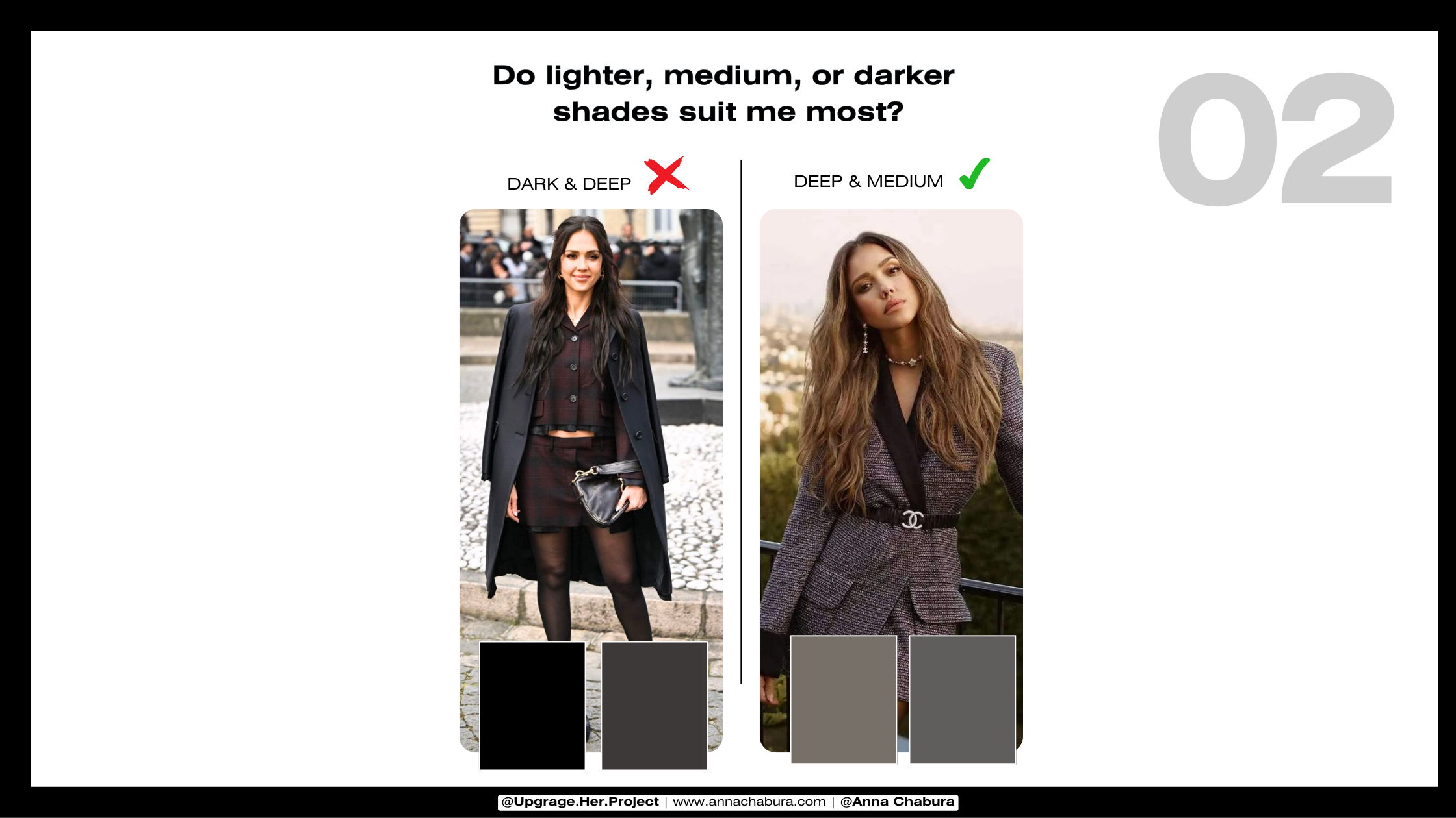
Do I suit light, medium, or dark tones best?
Do I shine in bold contrasts—or blended, soft looks?
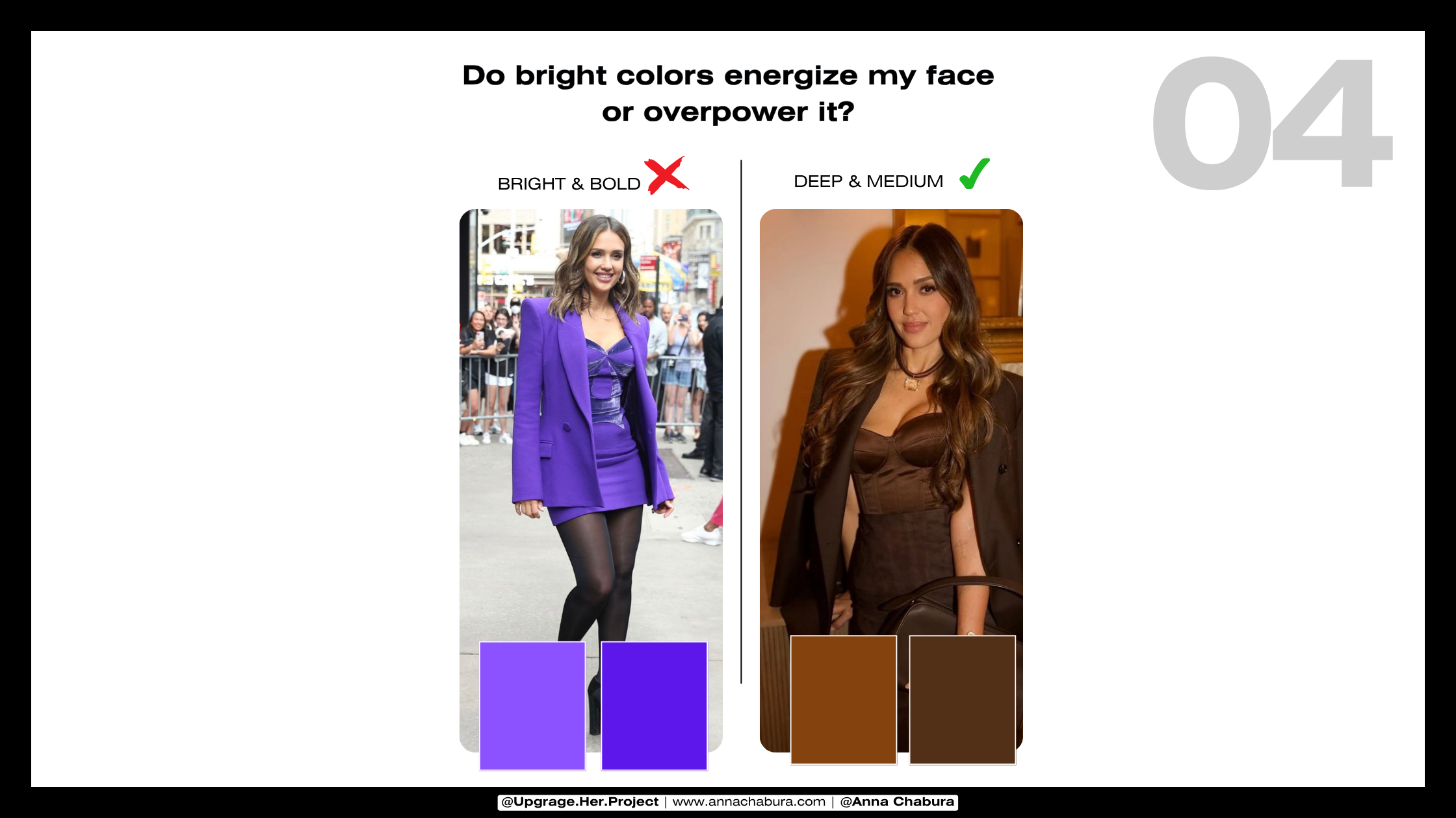
Do bright colors energize my face—or overpower me?
Can I wear deep, dark colors near my face—or should I push them lower?
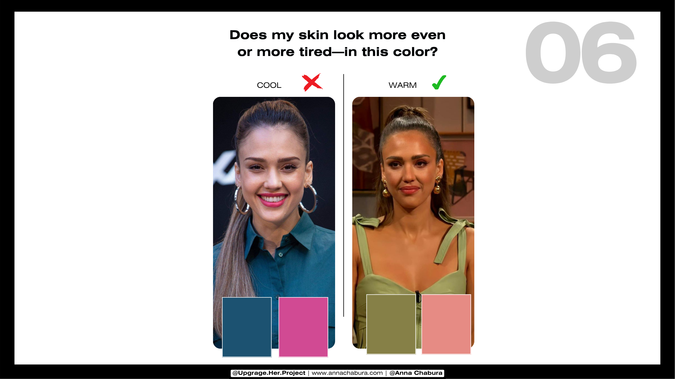
Does this color even out my skin—or make me look tired on camera?
If you don’t know the answers, that’s exactly what online color analysis is for.
How to look better on Photos and Camera- color analysis tips

Online Color Analysis - Anna Chabura
Tips & Hacks for Women Who Need to Be Camera-Ready 24/7
Skip pure white if you’re warm-toned. Choose cream, ecru, or light camel for a softer, more flattering effect.
Avoid stark black if you’re soft or light. If you do wear it, keep it away from your face. Charcoal, espresso, or deep navy are better options.
Use your color palette for more than clothing. Match your nail polish, lipstick, blush, and eyeshadow to your tones for a cohesive, polished look.
Wear your best colors near your face. This is especially important for speaking events, video content, and profile photos.
Plan your shoots with your palette in mind. Make sure your wardrobe, background, and makeup are working together—not competing—for a visually cohesive result.

Online Color Analysis: Your Personalised Style Blueprint
This isn’t just a palette—it’s your full style breakdown.
With your online color analysis, we go deep. Together, we’ll look at what’s not working (and why), and what actually flatters you—on camera, in real life, and everywhere in between.
What we’ll cover:
What undertones you really have (even if you’ve been told otherwise)
Whether you suit deep, bold shades—or softer, blended ones
The tones that drain you—and the ones that make your face light up
Why some of your “best” outfits don’t photograph well (and how to fix it)
You’ll get:
A custom digital palette tailored to your features
A full analysis of your undertones, contrast, and chroma
Clear do’s and don’ts—plus tips for clothes, makeup, hair, and shoots
Real-world outfit guidance you can use right now (not just Pinterest inspo)
This is all about giving you clarity.
No guesswork. No overwhelm. Just a smarter way to shop, dress, and show up looking like you—but better.

Anna Chabura - Personal stylist & Image Consultant for Women in Business